________________________________________________________
The Punisher (2014)
________________________________________________________
The Punisher Vol. 9 #1(April 2014) ________________________________________________________
The Punisher Vol. 9 #2(April 2014) ________________________________________________________
The Punisher Vol. 9 #3(May 2014) ________________________________________________________
The Punisher Vol. 9 #4(June 2014) ________________________________________________________
The Punisher Vol. 9 #5(July 2014) ________________________________________________________
The Punisher Vol. 9 #6(August 2014) ________________________________________________________
The Punisher Vol. 9 #7(August 2014) ________________________________________________________
The Punisher Vol. 9 #8(September 2014) ________________________________________________________
The Punisher Vol. 9 #9(October 2014) ________________________________________________________
The Punisher Vol. 9 #10(November 2014) ________________________________________________________
The Punisher Vol. 9 #11(December 2014) ________________________________________________________


Exactly like you, I found 3 Green Arrow covers that made my choice extremely difficult.
Bronze medal to the cover you chose. Bearded Green Arrow, shredded costume, flaming sky, detailed background… how could I exclude a cover that contains almost all my staples?
Silver medal to Green Arrow Vol. 6: Futures End #1. Pouring rain, a very eye – catching thunder, Oliver’s face ominously hidden under the cape, a question – raising broken tombstone, some smoke exhaling from it… this cover is so full of awesome details that, each time I look at it, I find something I hadn’t noticed until then.
Gold medal to Green Arrow Vol. 6 #35. First of all, we’re seeing the scene through the eyes of a sniper: I know it’s an hackneyed artistic choice, but I can’t help it, I love it.
Secondly, I love the background on the left of the cover. Not only because it’s very accurated, but also because the tone of blue used to colour it creates a wonderful atmosphere.
Thirdly, I love the artistic choice of including some supporting characters on the right of the cover. It makes the observer think that each of them will play a key role in the issue, and I love when the supporting characters aren’t merely accessory.
As for Frank, I had already praised the cover you chose in a Covers of the Week post (https://thegothamrogue.wordpress.com/2014/09/10/your-day-in-court-a-wacky-standoff-and-giving-you-the-finger-comic-book-covers-of-the-week-090314/), and I confirm that this cover is a real gem.
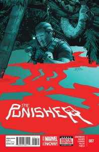
Special mention for The Punisher Vol. 9 #7: I know that our choices are supposed to be based solely on the cover, but the content of this issue is so wonderful that I really can’t exclude it from the podium.
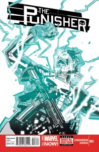
Bronze medal for The Punisher Vol. 9 #1, because it’s the issue that started Edmonson’s run on the title. In the next 10, 20 and 30 years we’ll look back to what Edmonson did for the Punisher and say “These comics are among the best ones I’ve ever read.”
“Silver medal to Green Arrow Vol. 6: Futures End #1.”
This cover just barely misses out on my Top 3. As for the other two stellar covers that I referenced, they are Green Arrow #33 & #34. I love the overall concept of having a scene play out in the background and then be contained by different silhouetted shapes. If I had to choose one over the other for second place it would have to be #33. I love the epic shot of Green Arrow and I love the silhouette of the dragon to signify the appearance of the latest antagonist in the series: Richard Dragon. Having the silhouette break away in certain areas is the final cherry on top as it ties into the arc’s name (broken) perfectly.
“Special mention for The Punisher Vol. 9 #7”
We are two for two as this cover is my silver medalist as well. I really like the image of Frank wading through the water, the blood floating on the surface forming a giant skull as well as the nice contrast of the cool and warm colours. Where we differ is with 3rd Place as I have to give it to Issue #9. The main title being the star as the image of the Punisher stands in the back, out of focus, so that are eye gravitates to the title and the hint of this issue’s very special guest star is simply fantastic.
Thanks, as always, for sharing your selections and providing your analysis!
Thank you as well for your reply! 🙂
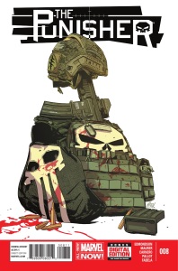
Green Arrow Vol 6 #32 is a fantastic “Broken” cover, very abstract, simple, with a great use of color and images within the fallen form of GA that makes it a really striking cover. Punisher vol 9 #10 is very moody, love the Punisher symbol on the cell wall as well. Great!
Sorry to disturb you Paul, I just wanted to tell you that you skipped one Retroactive post: https://thegothamrogue.wordpress.com/2014/12/28/retroactive-detective-comics-2014-amazing-spider-man-2014/. Happy New Year! 🙂
HI Wayne. Thanks for letting me know. Must have missed that while I was on Christmas break. Cheers & Happy New Year
The whole trilogy of “Broken” covers are a real standout effort by the artist with two of the three capturing 2nd and 3rd for me while your choice rounds out my Top 5. Thanks for sharing.
I agree, great how these cover stand out from the rest, makes it difficult to choose between them.